

UI Redesign
Project background:
As the second year of learning UI/UX, I explore more professional skills of creating interface. I learned that it is not enough for an interface to look good, it needs to be reasonably aesthetic. By reading two articles on UI structure, I learned that the reasonableness of UI structure is even greater than the aesthetics.
Project goal:
When I was doing this project, I was suffering from colour pattern and UI structure. Back to that period, I just creating the interface referencing to my directly thinking, when I got in touch with these design principles, I thought this could be a chance to improve my UI skills from a perspective other than aesthetics. Although my aesthetic skills such as colour matching may still not be very good, through this case study, my interface is at least reasonable and in line with user guidelines.
Project Duration:
2021.04 - 2021.06
Reading materials

Two articles with illustrated examples made it very intuitive for me to understand the user interface design theory. As I studied these articles, I also took notes, these useful resources will not only for this project, they will be with me in the future projects as well.
Even I am happy to improve my UI skills, but my ability on this area is just not strong enough. Therefore, my main challenge on this project, is to completely recreate the interface style as much as possible while keeping the functionality and structure unchanged, and to make the interface as beautiful as possible while making it structure reasonability and in line with the theme of sustainable living.
Main challenge
Problem pages


This project is completed at the end of first year UX program, with fully UX process. When creating this project, I spent more time on concept and idea, not the interface. As I now have deeper understand of UI. I analysis the problem page by page.
Problems
Problem 1: The progress bar
Principle: Responsiveness Defined
Solution: Change the shape of this bar
Problem 2: The ‘text disappear time’
Principle: Designing to meet real-time human intercation deadlines
Solution: Make text stays longer
Problem 3: The ‘text itself’
Principle: Don’t make me think - Not thinking
Solution: Change the text
Problem 4: The progress screen
Principle: Don’t make me think - You can’t make everything self-evident
Solution: Change the text and bar style

Problem 5: The ‘Main item area’ at the top of this screen
Principle: How we really use the Web - We don’t read page. We scan them
Solution: Redesign the panel style
Problem 6: The ‘Item detail screen’
Principle: We follow information ‘Scent’ toward our goal
Solution: Add hint to show the discount code exist
Problem 7: The meau bar
Principle: Don’t make me think - Obviously Clickable & Combining flaws that disrupt reading
Solution: Change the colour
Problem 8: The search area
Principle: How we really use the web - We don’t figure how things work. We muddle through & We prefer familar paths & Don’t make me think - Obvious/Thinking
Solution: Keep it simple
Redesign solutions


Testings and results
During this project, I was introduced to A/B testing. This is new type of testing method and most of my testings are based on this new method. A/B testing is similar with the control group/experimental concept in science area. For having the same task for different group of participants, I can clearly see how my redesign has improved.
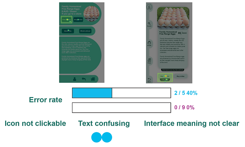
Test 1: A/B Five Seconds Test


Test 2: A/B Useability Test


Test 3: A/B First Click Test


I would say, the colour and overall style is not greatly improved, the vast majority of improvements are for the UI structure and details, although they are not huge changes, but from the results, these changes are successful, the success rate of each task has been more significantly improved.
Failed colour pattern attempt
I was trying to change the colour pattern as well, but as fit with the ethical shopping theme, I still want to keep the light green theme. The final version was kind of inspired from the Starbucks theme, I picked mint green instead of light green. And a deeper green as well.

Redesigned UI showcase


Personal reflection and project summary

I always know that my UI is not that pretty, but now at least my UI can make some senses now. I always believe that my focus is more about UX rather than UI, but I am still glad I study this UI skill to become a designer that cover more areas.
There is other two redesign projects in progress at the same time duration, but there is also mobile interface as well. I hope when I could try redesign desktop and tablet interfaces with these principles when I have free time.